Form
Sizes and Types
The bootstrap form builder has a few things that it considers globally important to a form.
Sizes can be looked at as the gutters everything will fall into. By default, we assume a label will be 2 columns and the inputs will be 10 columns. This can be changed using setSizes() at any time.
Note
Sizes only apply to horizontal type forms.
Type describes the bootstrap form type. A type can be basic, inline or horizontal. You can see details on the types at getbootstrap.com.
Form Groups
To use bootstrap form groups is actually pretty easy.:
{{ Form::groupOpen() }}
    // Form elements
{{ Form::groupClose() }}
To make things easier, when calling groupOpen() you can pass up to 3 sizes and it will reset the sizes for this group. The form will switch back to the previous sizes once the form group is closed.
Form groups have a few optional addendums that you can use to better control the output.
Sizing
You can add lg or sm to change the input sizes of the form group elements.
{{ Form::lgGroupOpen() }}
Offset Inputs
For checkboxes, radios and submit buttons, you may not have any labels on the left (primarily on horizontal forms). For these situations, open an offset form group.
{{ Form::offsetGroupOpen() }}
Validation States
Bootstrap also gives nice validation states to form groups. These are success, warning and error.
{{ Form::warningGroupOpen() }}
Feedback
Lastly, form inputs can have icons denoting feedback. These too require a special form group.
{{ Form::feedbackGroupOpen() }}
Putting it all together
The bst thing of all is that these groups are not exclusive. You can combine them as you wish to get any result you need.
{{ Form::warningFeedbackGroupOpen() }}
{{ Form::errorOffsetLgGroupOpen() }}
Inputs
Now that we can open form groups, let’s dig into inputs. These are the basis of all forms, so they deserve attention.
Each form element that is called automatically gets the class form-control added to it. Certain specific elements get
default classes added to them as well but will be covered in their own area below.
label
This element will have the sr-only class applied to it on inline forms and col-md-<label size> control-label for
horizontal forms.
Note
Be careful with this. If you call this and also set the label parameter on your input, two labels will show up.
| Parameters | Required | Default | Notes |
|---|---|---|---|
| $name | Yes | The name of the element this label is for. | |
| $value | No | null | The text displayed for the label. |
| $options | No | [] | Any attributes to add to the element. |
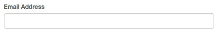
Code
{{ Form::label('email', 'Email Address') }}
{{ Form::text('email') }}
HTML
<div class="form-group ">
    <label for="email">Email Address</label>
    <input class="form-control" name="email" type="text" id="email">
</div>
Output
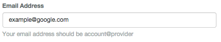
help
The help method will add help text to a given element.
| Parameters | Required | Default | Notes |
|---|---|---|---|
| $text | Yes | The text that will be displayed. | |
| $options | No | [] | Any attributes to add to the element. |
Code
{{ Form::text('email', $user->email, [], 'Email Address') }}
{{ Form::help('Your email address should be account@provider') }}
HTML
<div class="form-group ">
    <label for="email">Email Address</label>
    <input class="form-control" name="email" type="text" value="example@google.com" id="email">
    <span class="help-block">Your email address should be account@provider</span>
</div>
Output
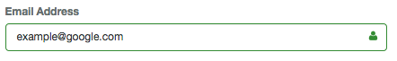
icon
This is used in conjunction with the feedback form group. It is what sets the icon inside of the input element.
| Parameters | Required | Default | Notes |
|---|---|---|---|
| $class | Yes | The class(es) of the icon to use. | |
| $options | No | [] | Any attributes to add to the element. |
Note
The form builder will take into account glyphicon and font-awesome classes for spacing.
Code
{{ Form::feedbackSuccessGroupOpen() }}
    {{ Form::text('email', $user->email, [], 'Email Address') }}
    {{ Form::icon('fa fa-user') }}
{{ Form::groupClose() }}
HTML
<div class="form-group has-success has-feedback">
    <label for="email">Email Address</label>
    <input class="form-control has-success has-feedback" name="email" type="text" value="example@google.com" id="email">
    <span class="form-control-feedback fa fa-user" style="top: 30px;" aria-hidden="true"></span>
</div>
Output
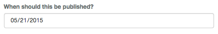
date
This will create a standard HTML 5 date input.
| Parameters | Required | Default | Notes |
|---|---|---|---|
| $name | Yes | The name of the element this label is for. | |
| $value | No | null | The text displayed for the label. |
| $options | No | [] | Any attributes to add to the element. |
| $label | No | null | Is this is supplied, it creates a label with this text for you. |
Code
{{ Form::date('publish_on', '2015-05-21', [], 'When should this be published?') }}
HTML
<div class="form-group ">
    <label for="publish_on">When should this be published?</label>
    <input class="form-control" name="publish_on" type="date" value="2015-05-21">
</div>
Output
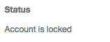
staticInput
This will create a text entry instead of an input element. See getbootstrap.com for more details.
| Parameters | Required | Default | Notes |
|---|---|---|---|
| $name | Yes | The name of the element this label is for. | |
| $value | No | null | The text displayed for the label. |
| $options | No | [] | Any attributes to add to the element. |
| $label | No | null | Is this is supplied, it creates a label with this text for you. |
Code
{{ Form::staticInput('Account is locked', [], 'Status') }}
HTML
<div class="form-group ">
    <label for="">Status</label>
    <p class="form-control-static">Account is locked</p>
</div>
Output
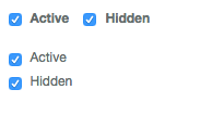
checkbox and radio
These are unique but similar to each other, so they will be tackled together.
| Parameters | Required | Default | Notes |
|---|---|---|---|
| $name | Yes | The name of the element this label is for. | |
| $value | No | null | The text displayed for the label. |
| $checked | No | false | Wether the element should be checked by default. |
| $options | No | [] | Any attributes to add to the element. |
| $label | No | null | Is this is supplied, it creates a label with this text for you. |
| $inline | No | false | This switched the elements to be inline instead of stacked. |
Code
{{ Form::offsetGroupOpen() }}
    {{ Form::checkbox('active', 1, true, [], 'Active', true) }}
    {{ Form::checkbox('hidden', 1, true, [], 'Hidden', true) }}
{{ Form::groupClose() }}
{{ Form::offsetGroupOpen() }}
    {{ Form::checkbox('active', 1, true, [], 'Active') }}
    {{ Form::checkbox('hidden', 1, true, [], 'Hidden') }}
{{ Form::groupClose() }}
HTML
<div class="form-group ">
            <div class="checkbox-inline">
                    <label><input checked="checked" name="active" type="checkbox" value="1"> Active</label>
            </div>
            <div class="checkbox-inline">
                    <label><input checked="checked" name="hidden" type="checkbox" value="1"> Hidden</label>
            </div>
</div>
<div class="form-group ">
            <div class="checkbox">
                    <label><input checked="checked" name="active" type="checkbox" value="1"> Active</label>
            </div>
            <div class="checkbox">
                    <label><input checked="checked" name="hidden" type="checkbox" value="1"> Hidden</label>
            </div>
</div>
Output
Everything else
Each other input is the same as illuminate/html defaults with the addition of a final parameter: $label. You can add
this to quickly create a label for any input you are using.
Code
{{ Form::text(name, value, options, 'Some Label') }}
HTML
<div class="form-group has-success has-feedback">
    <label for="email">Email Address</label>
    <input class="form-control has-success has-feedback" name="email" type="text" value="example@google.com" id="email">
    <span class="form-control-feedback fa fa-user" style="top: 30px;" aria-hidden="true"></span>
</div>
Output
Helpers
open
The open method is pretty much the same as Laravel default but with an optional second parameter. This allows you to set the form type when opening the form. It also makes sure your form has the correct bootstrap class based on the type you chose.
| Parameters | Required | Default | Notes |
|---|---|---|---|
| $options | No | [] | Any options to pass to the form. |
| $type | No | horizontal | The form type (basic, inline or horizontal). |
{{ Form::open([], 'inline') }}
setSizes
This is used to set the sizes for the entire form. Use it before opening the form. If only the first parameter is sent, the second size will be 12 minus the first (to allow for a full bootstrap column set).
| Parameters | Required | Default | Notes |
|---|---|---|---|
| $labelSize | Yes | The size for labels (left most column). | |
| $inputSize | No | 12 - ($labelSize) | The size for the inputs (center or right column). |
| $iconSize | No | 0 | An optional third column for anything extra (right column). |
{{ Form::setSizes(4, 6)->open() }}
setType
This is used to set the type manually (outside of the open() method). This too must be called before opening the form.
| Parameters | Required | Default | Notes |
|---|---|---|---|
| $type | No | The type to set the form to. (basic, inline or horizontal). |
{{ Form::setType('basic')->open() }}
To-Do
- input groups