New CSS Classes
Backgrounds
A number of background colors have been supplied. These can be added to any element as they just set the background color to the themes predefined colors.
| Class | Brand color |
|---|---|
| bg-primary | brand-primary |
| bg-info | brand-info |
| bg-warning | brand-warning |
| bg-danger | brand-danger |
| bg-success | brand-success |
| bg-inverse | brand-black |
| bg-purple | brand-purple |
| bg-radiation | brand-radiation |
Badges
There are a few new badge classes. These work the same as standard classes and use the corresponding brand color for their background color.
- badge-primary
- badge-info
- badge-success
- badge-warning
- badge-danger
Code
<span class="badge badge-primary">10</span>
Output

Buttons
This is meant to be an inverted button. It varies by theme, but will always match the default theme settings.
- btn-inverse
Code
<button class="btn btn-inverse">Go Back</button>
Output

Panels
We have worked to add quite a few useful additions to panels. These are all completely optional of course, but we feel they add a lot of functionality people would find useful.
Panel Alerts
Panel alerts are used when you need to alert the user to some details about what the panel contains. You could also use them to detail errors and messages from form submission if you chose as well.
Code
<div class="panel panel-default">
    <div class="panel-alert panel-alert-info">Info Alert</div>
</div>
Output
| Class | Image |
|---|---|
| panel-alert-info | 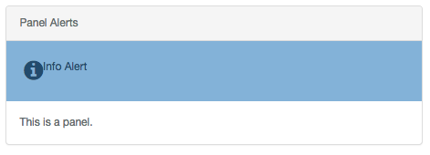
|
| panel-alert-warning | 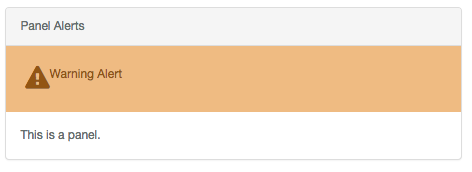
|
| panel-alert-danger | 
|
| panel-alert-success | 
|
Panel Buttons
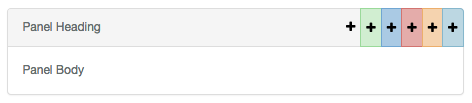
Panel buttons are used to add quick and easy buttons to the panel heading. These come in all the common classes or a classless version.
You can have as many or as few as you want. Just keep adding them to suit your needs.
Code
<div class="panel panel-default">
    <div class="panel-heading">
        Panel Heading
        <div class="panel-btn primary">
            <a><i class="fa fa-plus"></i></a>
        </div>
    </div>
    <div class="panel-body">Panel Body</div>
</div>
Output
| Class | Image |
|---|---|
| primary | 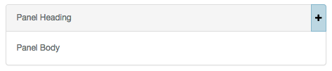
|
| info | 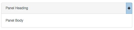
|
| warning | 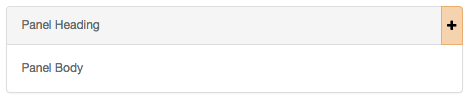
|
| danger | 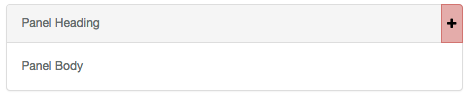
|
| success | 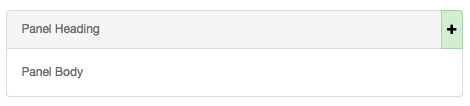
|
| <none> | 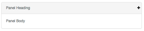
|
Text
The only addition to text is the inclusion of text-primary as a class. This will set your text color to the brand-primary.
<p class="text-primary">Something</p>
Tables
The only addition to tables is the inclusion of a primary table row class to use your primary brand color.
<tr class="primary"><td>Something</td></tr>
Wells
Wells have been upgraded slightly to have a bit more styling. The inclusion of the well-title helps distinguish wells on a page.
Well Title
Code
<div class="well">
    <div class="well-title info">Well title</div>
    Default Well
</div>
Output
| Class | Image |
|---|---|
| <none> | 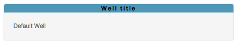
|
| info | 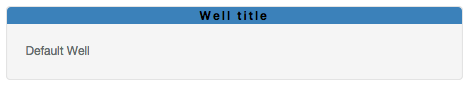
|
| success | 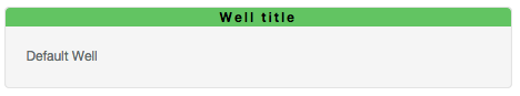
|
| warning | 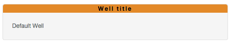
|
| danger | 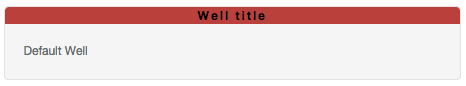
|
Well Title Buttons
Well title buttons work like panel buttons. Unlike panel buttons, there can only be one at a time.
Code
<div class="well">
    <div class="well-title">
        <div class="well-btn well-btn-right"><i class="fa fa-plus"></i></div>
        Well title
    </div>
    Default Well
</div>
Output
| Class | Image |
|---|---|
| <none> | 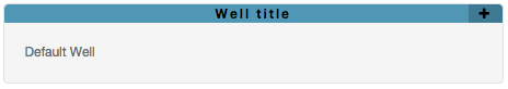
|
| info | 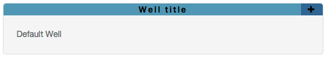
|
| success | 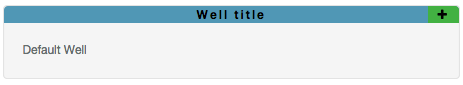
|
| warning | 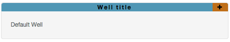
|
| danger | 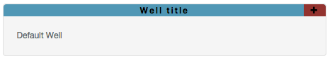
|